I wish the record was looking a little bit better for my first (of what I hope to be many) pinch hit AB of the year, but I am thrilled to be back!
The play on the field hasn’t been great this year (though it sure is wild how good back-to-back can make you feel) so I’m gonna take this (6-9, nice) moment to share a take that is truly in the spirit of this blog — something that is not all negative. In fact, its mostly positive! And when I saw a slew of new City Connect uniforms get officially unveiled this week, I knew it was time that someone said it.
The Mariners have the best uniform set in baseball.
A TLDR for people who are here strictly to read about baseball
– Northwest green is the best color in sports
– Navy blue is the best neutral uniform color
– The Steelheads uniforms are the cleanest of any throwback in the league.
– The only reasonable argument against the Ms uniform set is that the current City Connects are atrocious.
I know that “best in baseball” is a big statement! I will hear reasonable arguments in favor of the Yankees or Dodgers (but not the Cardinals) for teams who have truly classic uniforms, but I still think the Ms do it best.
On Northwest Green
The northwest green jersey is the best uniform top in all of sports. It’s a perfect color that represents its team and its place as well as any you can think of.
It’s timeless in a way that most things started in the 90s are not. The northwest green top debuted in 1993 – a time when people didn’t know a lot about Seattle. But as soon as Junior and the M’s put that uniform on, they were the shit. As Jon Bois put it:
“The Mariners were the coolest team in baseball. In a time when domes were still cool they played in the King Dome, which sat in the shadow of the Cascades and in the middle of a mysterious distant city whose cultural exports were computer stuff, Nirvana, and the Space Needle… A far away futuristic paradise.”
Choosing a shade of green leaning-teal was a very 90s choice. But it made sense for the Seattle Mariners – a pop of futuristic green up against the deep blue of the ocean. Something that felt a little out there for everyone else but just right for folks in the Pacific Northwest.
Everyone else bailed on their 90s looks. The Dbacks, Marlins, and (Devil)Rays – the teams who I think had the most 90s coded color schemes in the 90s and early 2000s – all bailed in favor of branding that still screams 2008. But, the Mariners always kept northwest green in the mix. And, while the jersey did get shelved for a few years, both good eras of Ms baseball have come with the boys in northwest green. I find it fitting that the drought was ended in this glorious jersey.
If you’re Gen X, Z, or a Millennial and you grew up in the PNW you have northwest green in your closet and it looks good whenever you put it on. There aren’t many things that launched in 1993 that you can consider timeless, but the Mariners gave us something that is. When you see that color you think of Seattle and if you watch baseball you can draw a straight line straight from Griffey, Edgar and A-Rod to Julio, JP, and Cal.
Navy Blue – Simple is Best
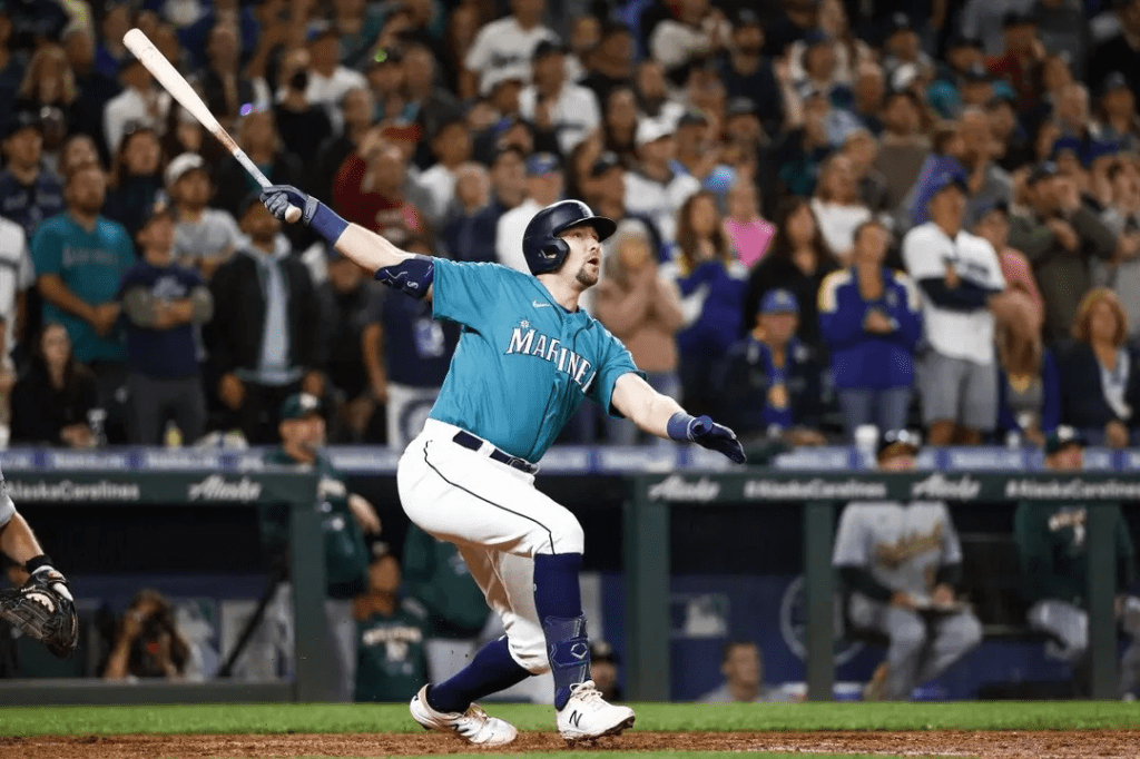
No waxing poetically on navy blue. I think It’s the best neutral uniform color. Black is overdone in sports (more on that later) and navy is both easy on the eyes and representative of the city. It makes sense given the maritime based team name and the color of the water just a few hundred yards from the stadium.
Having a loud primary color as your main color puts you at a big disadvantage. Using navy as the primary color lets northwest green shine. “Seattle” in silver looks great against the navy, and while I do miss the road grays, I’m never mad that I get to see the navy tops all of the time.
An Ode to a Classic
Baseball has always done a middling job of honoring the Negro leagues and the Black teams and players from that era who were not allowed in the major leagues. I’m thrilled that the Mariners have decided to included the Steelheads uniform as part of their full-time rotation because I think it is a sustained, good faith effort to honor their contribution to baseball in the Pacific Northwest.
Also, they are absolutely fire. They allow the Ms to tastefully depart from the core color scheme in a way that makes sense (to honor a past team from our region) while really highlighting what made uniforms from that era shine. Bold block lettering, thick piping, off-white–I love them. And I love when a throwback isn’t just for a special occasion.
Not Connected
Remember, this take is mostly not negative.
I think the Mariner’s current City Connect uniforms are trash.
Black baseball pants shouldn’t be on a professional baseball field (or on any baseball field if a team wants to look good), and they make absolutely NO sense for the Mariners.
First and foremost black isn’t in the color palette for any iteration of the Mariners. I’m not a fan of uniforms outside the color scheme unless it makes sense. I actually really like the idea behind the City Connect uniforms across sports, and think it has been done well a few times: Boston RedSox green monster jerseys – fantastic, Miami Heat “Miami Vice” uniforms – very fun, Trailblazers PDX carpet jerseys – amazing.
But if you’re doing it just to do it. I’m not for it. Oregon and Nike started using colors liberally in uniforms during the early 2000s and it has permeated all of sports. When teams started mixing black into their uniforms when it wasn’t part of their color scheme, legendary sports uniform writer Paul Lukas dubbed this “black for blacks sake,” and I think that is exactly what is going on here. Someone at Nike wanted to get black into the M’s City Connects because it’s cool and because they are lazy. It’s ugly and it makes a pretty good jersey look silly.
I will note that the official uniform description says that black is included to honor the Seattle Steelheads (who didn’t wear black pants from what I can find). Suuuuuuuure. IF that is truly why black was included in this uniform, then I think it was well intentioned but poorly executed. Now that we are wearing the actual Steelheads uniforms surely we don’t need the black pants anymore. Right?!
Finally, as my brother (the primary author here at TCB) pointed out, this uniform makes them look like scuba divers–or as he put it–literal mariners… Last time I checked, we don’t want the baseball team looking like they are moving through water, but maybe that is just me.
In Summary
I’d also be remiss to not make any mention of the discontinued Sunday crème uniforms. They were fine. I love a cream colored uni, but I never really understood yellow on cream and I prefer the Steelheads look.
Anyway, the Mariners current uniform set is elite. The best in baseball despite having one big miss. I wish they would wear the northwest green top more often (and at home!), and I hope they get new City Connect uniforms next year that don’t suck. Look good, feel good, play good.
-DB